
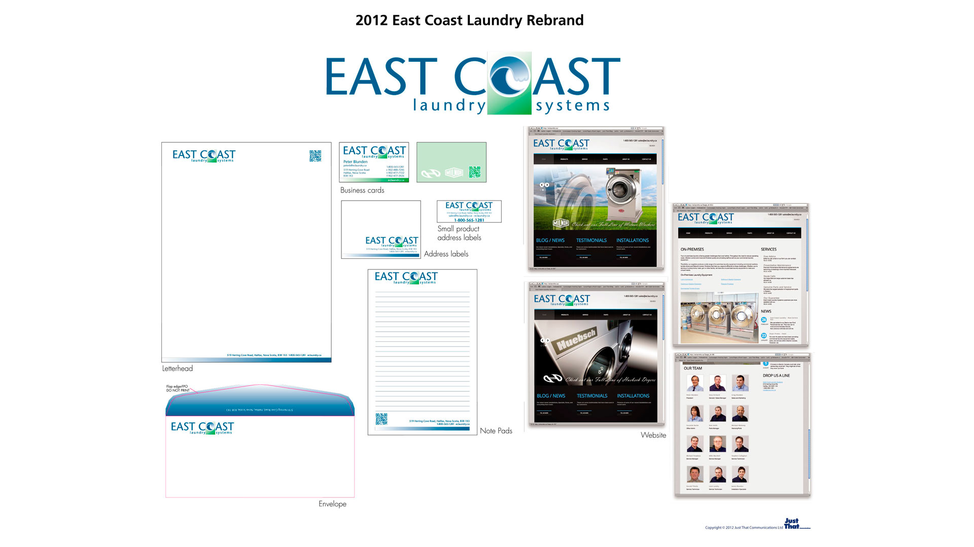
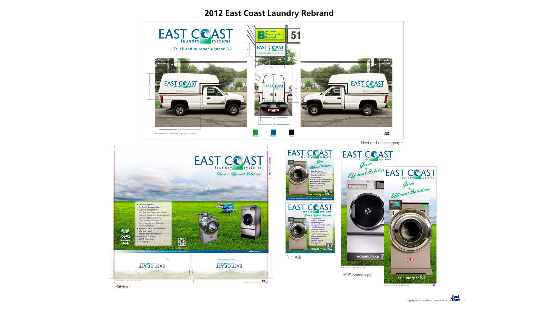
eastcoast laundry.
Client:
East Coast Laundry Systems
Brief Project Title and Description:
New Branding, marketing material and web design
Role on this project:
Creative Direction
Art Direction/Design
Production/Technical Execution
Illustration
Photography/Photo Illustration
Web design and execution
Project Considerations:
Concept guidelines/message base: Express the regional perspective along with the companies clean outlook towards the environment. We must be careful not to segregate the selling zone to just “Canada” (Bermuda is included in the companies territory). The Coast should be reflected with an element that portrays the geographic location of the companies reach. It is, of course, important to visually reflect the fact that the company offers “laundry” solutions/systems.
Keywords/phrases: Previous incorporation name (East Coast Laundry Equipment).
East Coast reflects regional reach. Laundry reflects the type of equipment sold and serviced.
Systems implies solutions encompassing all aspects of laundry equipment used.
Purity of water, East Coast clarity, East Coast Environment, tough and clean.
Up to date solutions and service, Modern, sophisticated, state of the art.
Graphic components: Colours chosen express clean and green (Green – refreshing, healing,
Tint: Aqua-sea-green (not grasss-green) – sophisticated) and East Coast Sea (Blue- dependable, cool)
All elements presented on white (imparts purity and simplicity, pristine and lightweight).
Font: Clean precise, classic sans serif, dependable, masculine yet not overpowering, round characteristics (not oval lettering) expressing “Global” (implies earth, green, clean), Light and airy yet has substance.
Visual Elements: Ocean Wave (geographic element)
Front loader is most recognizable machine offered
(quick recognition)